
Exploring traffic flows in Power BI
(this is the original text except I’ve removed the link to the Power BI report)
An introduction to version 1 of the visuals pack
This post introduces version 1 of the Power BI visual pack for traffic flows. I am sure I will change the pack over time, and when I do I will document any major changes here.
First off - the pack is hosted on the public-facing Power BI site (link removed). Click on the link and you will see a page with a choice of survey and a map of survey locations.
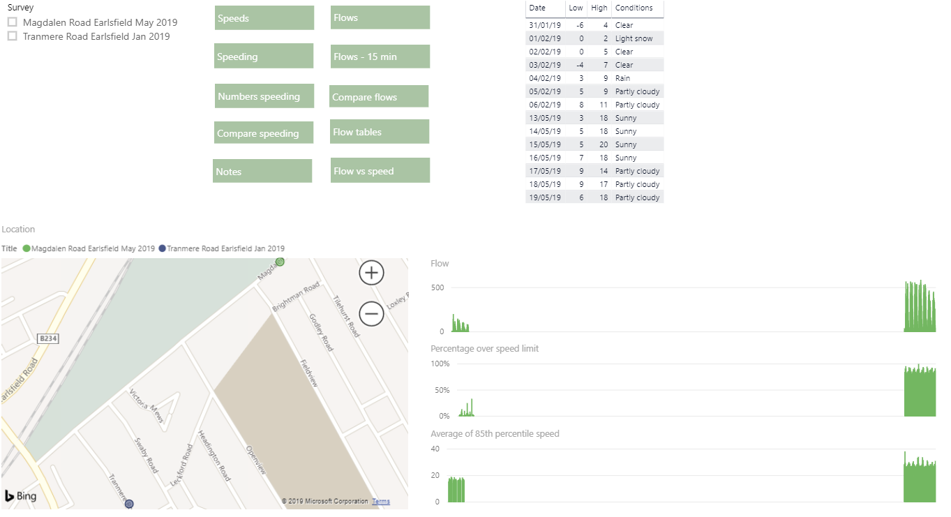
Choose a survey and the right-hand side of the first page will show the weather conditions and some summary charts for vehicle flows, mean speeds and 85th percentage speeds by hour.
Click on any of the menu links to go to the following pages, on many of which you can select weekday/weekend, flow direction and period of day:
Speeds - mean speeds and 85th percentile speed by hour, summary of mean mean (sic) speed and minimum mean speed for each hour
Speeding - percentage over posted speed limit, percentage over speed limit plus 5 mph, percentage over speed limit plus 15 mph
Numbers speeding - as previous page but raw numbers
Compare speeding - tables comparing speeding in the surveys
Flows - flow by vehicle type and broken out into bicycles and lorries
Flows - 15 min - all vehicle flows in 15 minute bins rather than hourly (not available broken down by type)
Compare flows - table comparing flows in the surveys
Flow tables - table enabling you to see the exact composition of flows
Flow vs speed - scatter showing flow versus speed
Notes - please read these since they may answer your questions
I will explain a lot more about these charts and data over the coming weeks. If you are interested in any particular issues or if you notice any mistakes please contact me.
Edit: I’ve added a simple histogram (based on the published 5mph bins) and a simple source table.