Choropleth callouts in R
Addendum to my last post on ONS data.
The problem with some maps is that it’s hard to see some areas in a larger map. Ideally we want to see both the big picture but also zoom in on a smaller area either because we’re specifically interested in it or because we couldn’t otherwise see it. This example shows how we can do a callout plot of the London area but the principle works just as well for any other area, you just need to be able to separately identify the area in question so we can pull out the relevant rows.
To be able to identify a wider area we need a lookup table from the smaller area to the larger area. Luckily ONS provides a series of lookup tables which we can read into R. I’ve downloaded the all-encompassing file which provides a lookup from ward to local authority to county to region to country and then read it with the following:
lookuptable <-
read_csv("input/Ward_to_Local_Authority_District_to_County_to_Region_to_Country_(December_2019)_Lookup_in_United_Kingdom.csv",
 col_types = cols(
 FID = col_double(),
 WD19CD = col_character(),
 WD19NM = col_character(),
 LAD19CD = col_character(),
 LAD19NM = col_character(),
 CTY19CD = col_character(),
 CTY19NM = col_character(),
 RGN19CD = col_character(),
 RGN19NM = col_character(),
 CTRY19CD = col_character(),
 CTRY19NM = col_character()
 )
 )
Note that I’ve overridden the default parsing to force all the ID columns to be character. Try without this to see what happens.
Now we want to identify just the local authorities in London. Since we’ve got ward level data we need to be careful here otherwise we’ll get a lot of rows for each local authority;
df3 <-
    lookuptable %>%
    filter(CTY19NM %in% c("Inner London", "Outer London")) %>%
    distinct(LAD19CD) %>%
    left_join(df, by = c("LAD19CD" = "admin-geography")) %>%
    filter(`age-groups`=="65+") %>%
    left_join(mapdata, by = c("LAD19CD" = "id"))
Line by line:
- Store the result of the entire pipe into df3
- Start with the lookup table loaded above
- Filter it to just those local authorities in the “counties” (CTY19NM) of Inner and Outer London
- Then just keep the distinct values of LAD19CD (the local authority code)
- Join that with the main data file
- Filter only the 65+ data
- Finally, join that with the map data
Note that when constructing pipes like this, experiment with each stage to see the intermediate results eg:
df3 <- lookuptable %>% filter(CTY19NM %in% c("Inner London", "Outer London"))
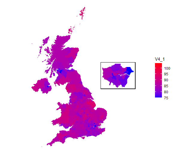
This is very easy - just copy the code back and forward between your script file and the console window. Anyway, go back to the full code. We can now plot this but with a slight difference. Because we want to plot this as an additional component of the big map we need to save it in a special object called a grob:
gLon <- ggplot(data = df3,  aes(  x = long,  y = lat,  group = group,  fill = V4_1  )) +  geom_polygon() +  scale_fill_gradient(low="#0000ff", high="#ff0000") +  coord_equal() +  theme_void() + theme(legend.position = "none") +
    theme(panel.border = element_rect(
        colour = "black",
        fill = NA,
        size = 1
        ))
grobLon <- ggplotGrob(gLon)
First, we generate the plot using just the London data (removing the legend and adding a plot border) and save it to an object called gLon. We can still plot that object by just typing gLon (and you’ll see another time how we can use this for plotting several graphs neatly). But instead we’ll convert it into a grob named grobLon.
We can then add the grob as an annotation on the main map:
ggplot(data = df2, aes( x = long, y = lat, group = group, fill = V4_1 )) + geom_polygon() + scale_fill_gradient(low="#0000ff",high="#ff0000") + coord_equal() + theme_void() + xlim(0, 1000000) + annotation_custom( grob = grobLon, xmin = 600000, xmax = 900000, ymin = 500000, ymax = 750000 )
I’ve changed the x limits to create such extra space and the x/y min and maxes have been determined by trial and error. Note that a different way to expand the limits is to use:
expand_limits(x = 1000000)
That way means you don’t have to specify the other end point.
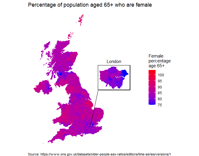
Anyway, the final map is shown below:
Again, you can prettify this by adding titles and a line from the callout to the London area. Changing the plot code to the following makes it look nicer:
ggplot(data = df2,
       aes(
           x = long,
           y = lat,
           group = group,
           fill = V4_1
       )) +
    geom_polygon() +
    scale_fill_gradient(low = "#0000ff",
                        high = "#ff0000",
                        name = "Femalenpercentagenage 65+") +
    coord_equal() +
    theme_void() +
    expand_limits(x=1000000) +
    annotation_custom(
        grob = grobLon,
        xmin = 600000,
        xmax = 900000,
        ymin = 500000,
        ymax = 750000
    ) +
    annotate(geom = "text",
             x = 750000,
             y = 780000,
             label = "London") +
    geom_segment(x = 530000,
                 xend = 600000,
                 y = 170000,
                 yend = 500000) +
    labs(title = "Percentage of population aged 65+ who are female",
        caption = "Source: https://www.ons.gov.uk/datasets/older-people-sex-ratios/editions/time-series/versions/1") +
    theme(plot.caption = element_text(hjust = 0, size = 8))
Notes on the above:
- I’ve used CTRL SHIFT A in RStudio to put in lots of space to make the code easier to read.
- I’ve used the name parameter in scale_fill_gradient to add a legend title (there are lots of different ways of adding a legend title)
- The title has the newline character (n) inserted to break it up
- I’ve added a text annotation for the callout box
- geom_segment adds a line
- labs adds a title and a caption
- and finally the last theme function changes the caption justification to right and reduces the font size
So the final product is: